At their best, graphs are pictures worth a thousand words, or better yet, art communicating only a few words but with deep meaning. But in a world of infographics, we also get visuals causing confusion and stirring debates well past that aspirational word count. In the spirit of trying to be more of the former and less of the latter, might a few graphs tell us something significant about the current state of humankind’s ability to get to space – and back? That is, other than saying SpaceX is leading and everyone else is following.
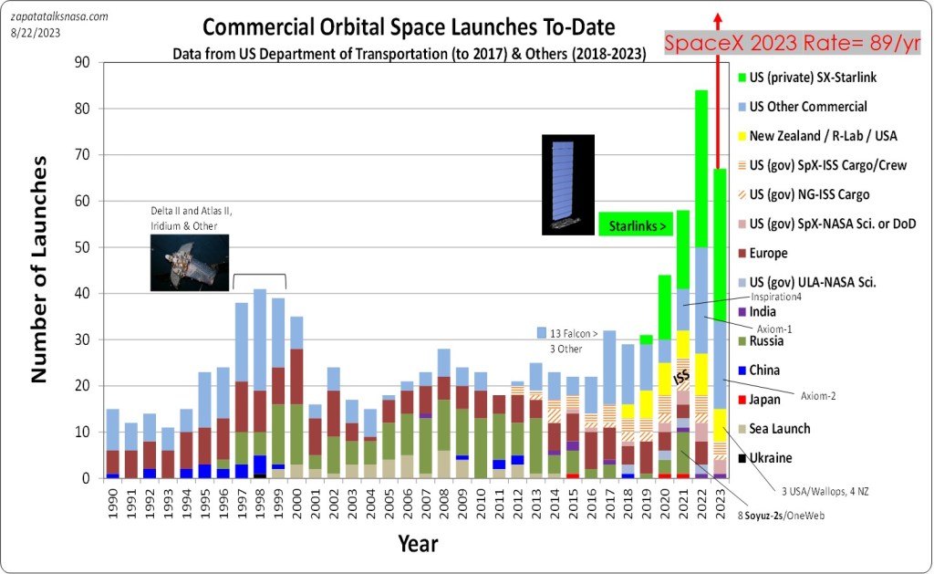
The global commercial launch picture shows a healthy hockey stick shape or at least the beginning of one. We can also see this is a Starlink show as much as about SpaceX’s rockets. At the much reduced and available prices SpaceX charges for the Falcon 9 launcher, the uptick in recent years remains on a par with the uptick seen in the late 1990s. A little more, but not much, were it not for Starlink. That 90s show ended in a bust. Launches then remained too pricey and low-rate in production, alongside satellites similarly hobbled, for communications constellations to succeed. Ground-based cell phone towers won the day, towers in space being a dream ahead of its time. (Though I once rented an Iridium satellite handset to use in an area with no working lines of communication. Something helpful came out of that burst of launches – emergency communications, albeit very pricey.)
…the burst in commercial launch is really about Starlink at this point…
Atop recognizing the burst in commercial launch is really about Starlink at this point, there is launch rate. SpaceX is on track to launch more often in 2023 than in 2022, with about 89 launches to judge from the 2023 record. That’s more than in 2022 with 61, but not quite a doubling or tripling. This is a sign the Falcon 9 system – launch pads in Florida and California, test stands, manufacturing, and Starlink manufacturing too – is already near its capacity. Were this an S-curve, we would say the “S” is flattening out (the top portion of the S.)
Does this support the SpaceX investment in Starship? And the continuing upgrades to Starlink satellites – as much about speeding manufacturing as about bandwidth? Meaning SpaceX knew the answer before the data came in for the rest of us – that dramatically improved tech is necessary for the next leap in launch rate? Time will tell, and the data.
A look at only US launchers (all launches, not just commercial) continues the tale. The SpaceX Falcon 9 launch line is recreating a rocket in ascent. Especially this year and last. Recently, ULA’s Tori Bruno expressed concern about possibly including a third provider in the next round of Space Force launch awards. As a bit of inside baseball, long ago, it was somewhat predictable in discussing competition in space launch to see convoluted segues into topics like capacity. The real issue, though, was rarely about meeting demand. Instead, and nearly always, we saw prime contractors obscuring the discussion. If you have high fixed costs and can’t attract enough (or really any) non-government business due to your prices, you can’t operate below a certain number of launches without operating at a loss. Six launches a year make a profit, but your ledger bleeds red at four. It’s not an issue of demand, or capacity, or even supply. It’s about competitiveness and launchers being quick on their toes.

All to say, the Space Force would do well to move to providers, all of which, all three and more, launch twice a week. Creating such a market is another matter, one I touch on often.
Reusability is the word – if someone pulled you aside at the big bash and said they have only one word for you.
Is that day around the corner? This brings us to the third graph. Reusability is the word – if someone pulled you aside at the big bash and said they have only one word for you. Reusability in graphing appears to be a scattershot of worthless blue and green points in no pattern. Yet, looking more closely, we see SpaceX got into a routine rather quickly as far as the time to turn around a booster and fly again. Only the occasionally odd booster deviates from predictable turnarounds of about 100 days.
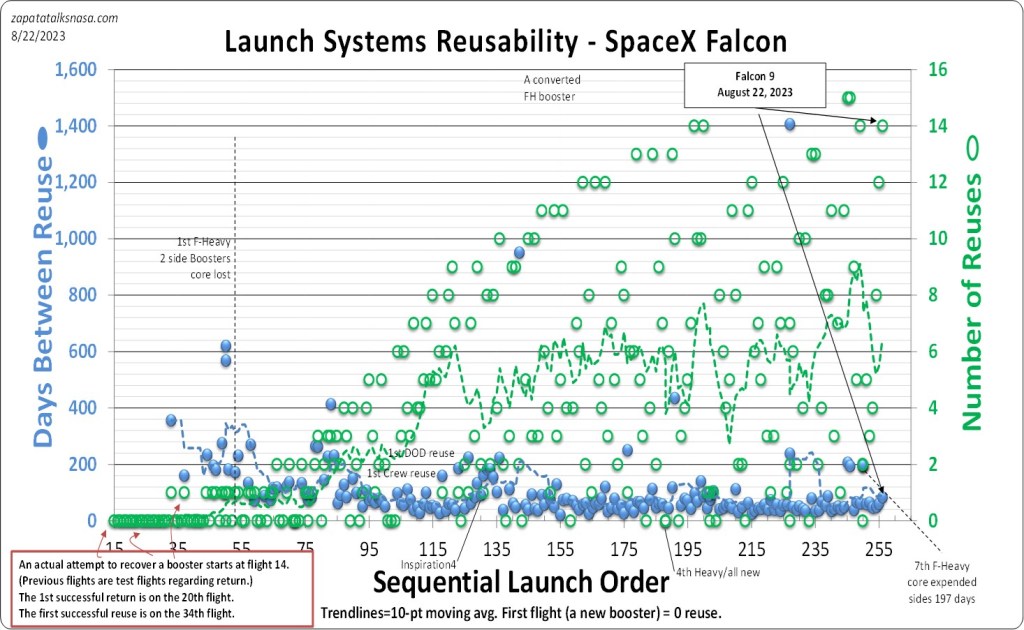
What’s more critical is buried below – the fewer and fewer boosters that have not been reused, being new, and all the launches in between. Only about ten new boosters have joined the SpaceX fleet in the last hundred launches. This is the better indicator that SpaceX reuse hovers at about ten reuses per booster. (Any trend line is adversely hit when a new booster arrives, so the back and forth between averaging six to seven reuses.)
We see through the data a unique time and capability in space launch. People going back and forth to space remains a special event, but it appears humanity now has a good truck for cargo to space, and it’s a reusable truck. Did anyone really think this would happen any other way? Nonetheless, the Falcon 9 data reflects both a company truck, launching SpaceX satellites for SpaceX, and a truck for hire. We have a way to go, yet the data says we are far from the days twelve years ago when Shuttle launches ended and Falcon 9 launches had only just begun. Access to space could use another near vertical line of launches, each point atop the prior. Maybe we won’t need to look at the data to understand the sea change in what’s happening when it’s for people, too.

Appreciate the graphs and perspective.
LikeLike
I’m glad you found the data and PoV useful.
LikeLike