It was only some years ago I wandered upon the word “wonk” or “wonkish” as a reference to someone diving too much into obscure details. It’s implied, annoyingly too much. First come the numbers, then come the graphs. The predictable debate comes right along – does X cause Y, or is it the other way around? Maybe there is no causal relationship at all. If you got that far, you too might be wonkish. Oddly, the big picture of one thing graphed against another, often just the year, is what analysts call the view at 100,000 feet. Yet somehow, it’s often seen as an excessive detail. Go figure (or graph, as you prefer.)

There is no lack of graphs for launch costs, or really prices a customer can expect to pay, the cost to them. It’s safe to assume NASA or any US customer’s launch costs are affected by the purchases of others, even if we don’t have access to the books. A company might have a certain customer pick up certain costs for example, rather than spread them among all customers. Why not assign a little more here, a little less there? For example, NASA launches crew and cargo to the ISS on Falcon 9’s and employs the United Launch Alliance Atlas V for its uncrewed scientific missions. (And eventually, an Atlas V will be used for NASA crew with Boeing’s Starliner.) So perhaps it’s worth getting a bit wonkish here and seeing what the data says about the costs of launch to the US Department of Defense.

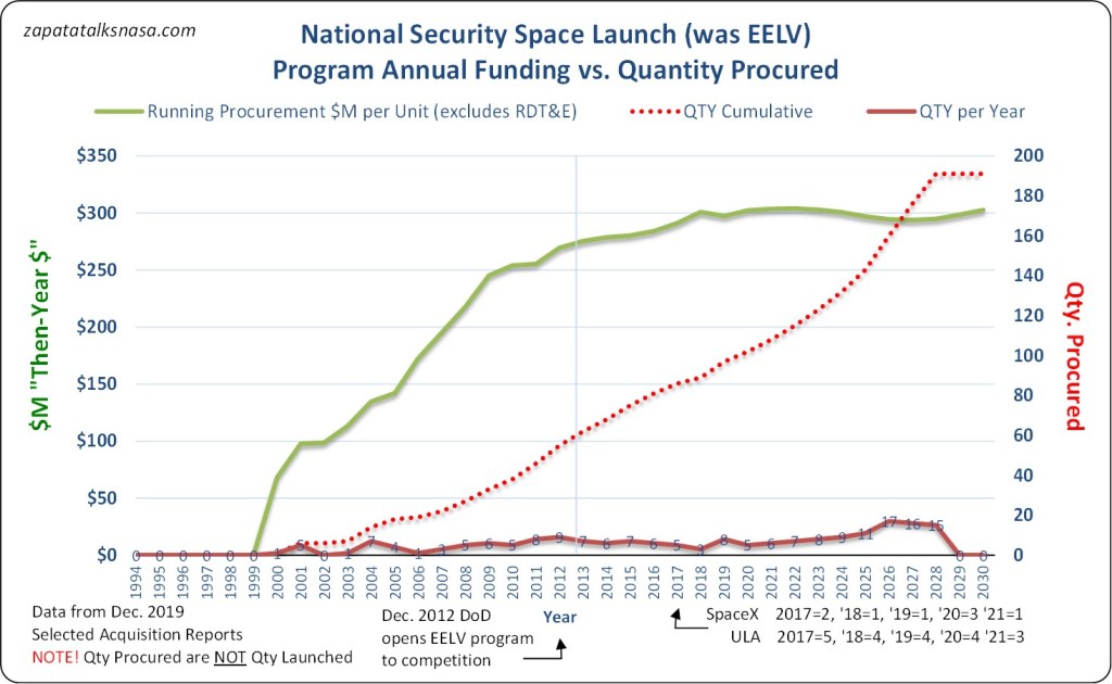
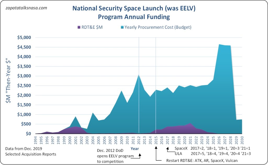
Shown are a couple of views on the National Security Space Launch program as of a valuable report from December 2019 entitled “Selected Acquisition Reports.” This report is a high-level summary, to an analyst anyway. It shows funds and such across time, helping with the questions – has the cost of launch to the US DOD dropped in recent years? Where is the SpaceX effect?

To get our bearings, the US DOD first introduced competition into national security space launch in 2012, but the first SpaceX launch for the DOD would not be till 2017. It was easy to predict then – change takes time. 2012 was also when US government auditors reported massive cost increases in the then-EELV program. As well, 2012 saw SpaceX dock its Dragon cargo spacecraft to the ISS for the first time. Still, it would be five more years before SpaceX launched its first secret payload for the US National Reconnaissance Office.
Now, more years have passed, so we have more data. Gather up enough numbers and who knows, we might see a line form that screams something. For example, the data shows that 2012 was a peak funding year, so the DOD buying launches had a peak “cost.” Since then, the good news, annual budgets for the Space Force buying launches have steered well clear of that peak $3 billion mark.
Of course, the question that follows is about costs per unit, the real indicator of the US DOD seeing savings or not. Here, there seems to be no significant drop in costs on a per-unit basis, at least in then-year dollars. There is no nose-dive in the line, that is. Yet a price holding steady over time, assuming there is inflation, is a price dropping in real terms to a customer. Notably, it seems 2012 was a turning point, after all. US DOD launch costs climb steadily up to here, then level off.
There is no more recent SAR report, but we know the yearly budgets here for 2020-2022 are significantly less than the numbers predicted in late 2019. Then again, there has been some drop-off in the launch rate, so the jury is still out. Officially, the DOD maintains it has saved billions since 2012. It would seem the data somewhat supports this – especially judging from a sense the running procurement cost per launch could have stayed on its original (unsustainable) trajectory.
What works against the elegance of all this X leads to Y and wonking out is those pesky SpaceX launches. SpaceX Falcon 9 launches for the US DOD have typically scored in the $90M range, leaving a gaping question. If SpaceX is the lesser launch provider by quantity, where is the rest of the yearly funding? An attempt to put an average running cost per unit is likely having one foot in boiling water and another in a bucket of ice. Is it fair to say that we are comfortable with the new temperature on average? Does the question have the meaning we started with at all?
All this could be settled. Some years ago, the US DOD kept abundant data online and public in “RDT&E” reports. These were yearly, very detailed, if excessively so, and helpful in ways a summary SAR report is not. (The detailed reports feed the summary.) These and other public access sites have all slowly gone dark, ironically, just as the competition heated up between SpaceX and United Launch Alliance. Of course, it’s all only a wonkish interest, as launch costs dropping for something as important as US national security space launch may be just an excessive detail.